To unlock the true potential of legal tech, it’s essential to consider the design of the technology itself.


We all have biases and are influenced by others’ biases, often unconsciously. These biases affect information perception, processing, and interpretation in visual and textual formats. It is essential to comprehend cognitive biases to craft engaging information experiences.
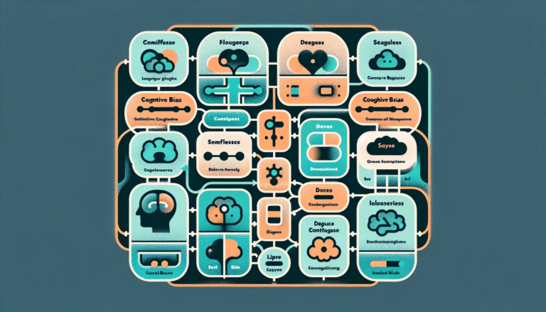
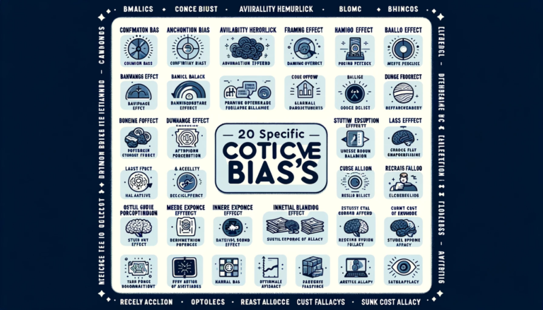
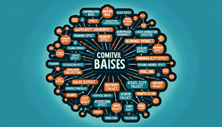
In this article, I will explore 10 cognitive biases and discuss their impact on visual and information design.

Cognitive biases are consistent patterns of deviation from rationality or logical reasoning in judgment and decision-making processes. They are mental shortcuts (heuristics) that our brains use to process information and make decisions quickly. Although these biases can be helpful in certain situations, they often lead to errors in judgment and decision-making.

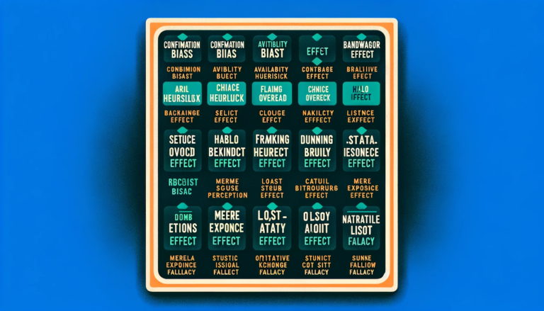
Confirmation bias refers to our tendency to seek and interpret information confirming our beliefs. It’s why people feel comfortable in their echo chambers. In visual and information design, presenting a balanced view and providing diverse perspectives is vital to combat this bias and promote unbiased understanding.
This bias suggests that the time it takes for a person to make a decision increases with the number of options available. You can use this bias to simplify interfaces and reduce cognitive load by presenting information and choices clearly and organised.
This bias suggests that users perceive aesthetically pleasing designs as more usable and intuitive, even if they may not objectively be. You can enhance the user experience by considering aesthetics alongside usability and creating visually appealing designs that are also functional and user-friendly.
The bandwagon effect refers to our inclination to conform to the actions or beliefs of others. In design, this bias can be leveraged by showcasing social proof, testimonials, and user-generated content to influence user behaviour and create a sense of trust and credibility.
Choice overload occurs when users are overwhelmed by too many options, leading to decision paralysis. You can combat this bias by employing precise categorisation, filtering options, and visual hierarchy to simplify choices and enhance decision-making.
The visual primacy effect suggests that information presented visually at the beginning significantly impacts memory and perception. You can utilise this bias by placing key information, such as important messages or calls to action, at the beginning of a visual or information design to maximise its impact.
Cognitive fluency refers to our preference for information that is easy to process and understand. You can leverage this bias by using clear typography, intuitive navigation, and concise visuals to enhance user experience and engagement. It’s the ‘Don’t make me think’ concept.
(See the book ‘Don’t make me think’ on web usability by Steve Krug.)
The Von Restorff effect states that unique or distinct elements are more likely to be remembered. You can utilise this bias by incorporating visually distinct elements, such as colour contrast or unique icons, to draw attention to important information and make it more memorable.
Designers (or lawyers, for that matter), driven to overestimate their skills, might overlook potential flaws in their creations. This bias can lead to the presentation of information in a way that assumes a higher level of comprehension from the audience than is realistic.
In the quest for visually appealing and aesthetically pleasing designs, there’s a risk of underestimating the importance of clarity and user understanding. Recognising and mitigating the overconfidence bias in design processes is crucial to ensuring that the final product effectively communicates information without assuming an unwarranted level of user expertise. Striking a balance between creativity and user-friendly clarity is vital to overcoming this cognitive hurdle.
In the vibrant visual and information design world, the Halo Effect takes centre stage, shaping how users perceive what’s in front of them. This cognitive quirk lets our overall impression of a person, company, or product colour our views on specific details. For designers, nailing that initial wow factor isn’t just about looks—it’s a strategic move. Positive first impressions create a design “halo” that influences users to see the entire experience positively. So, crafting engaging designs isn’t just an art form; it’s a clever play at creating a positive ripple effect that echoes throughout the user journey.

Anyone who writes or creates visuals can create experiences that effectively communicate, engage, and influence users by recognising and understanding these cognitive biases. From addressing confirmation bias to leveraging the Von Restorff effect, incorporating these insights into your creation process will enhance user experiences and deliver impactful and memorable designs. Let’s harness the power of cognitive biases to shape content that captivates and inspires.

Note for the nitpickers and eager beavers: yes, there is a ton more we can say about cognitive biases, and there are many more that are relevant regarding visual and information design. This article only scratches the surface; a stack of books can be (and has been) written on this matter! If you’d like to contribute, please share your thoughts below.

Anna Posthumus Meyjes is a legal designer based in Amsterdam, the Netherlands. She brings creativity, design and a user-centred approach to law. Anna worked as an attorney-at-law in an international litigation practice for ten years before founding a legal design agency, Aclara Legal Design. Aclara Legal Design provides legal design products and services that improve communication and usability of legal information and services.